Radio Reade
Labels: advertising
Starbucks Hmm
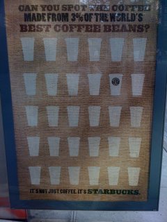
This ad makes me think that Starbucks (or their ad agency) needs a grammar lesson. My first reading made me ask about the other 97% of Starbucks' coffee beans. My second reading (a day later) made me think that Starbucks hasn't dominated the market for the best beans, which has other implications. The third reading (yet another day later) was no clearer, and prompted the picture.
Best of all: no impact on my patronage! I rarely went to Starbucks before I saw these ads, and that hasn't changed. Maybe, given the economy, that's its own kind of success?
Labels: advertising
Foreign Exchange
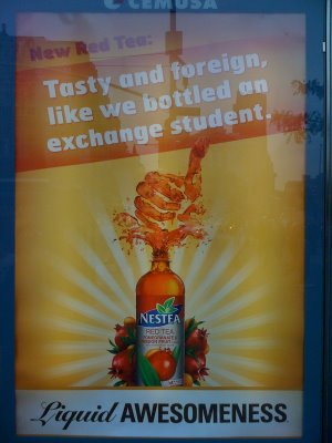
I've passed by this ad for a few weeks now and finally got a picture. While Nestea has built a very robust "
Liquid Awesomeness" website to carry the whole campaign to its logical and absurd conclusion ... I'm not feeling the love on the bottling-a-foreign-exchange-student concept. It's just odd, and frankly, seems disconnected from "Steve" and the
broader ad campaign.
Plus there seem to be some gaps in the scope of the campaign. For example, search for "Liquid Awesomeness" on Facebook and you get to the group for
Jones Soda is Liquid Awesomeness. (And I just have no doubt that's true.)
For anyone interested, Adverblog has a longer description of
the website and its development. Personally, I prefer my liquid awesomeness in coffee form.
Awesomely yours,
Labels: advertising
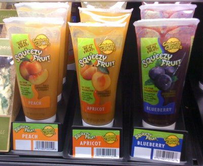
More great product news: if you're not so much interested in Dunkin' Donuts after seeing the calorie report
from my last post, then perhaps you'll be interested in this new item I found on Friday at my local supermarket:
Squeezy Fruit (or Squ'eezy Fruit), made by
Goodness Gardens of New Hampton, NY.
First, there was
Go-Gurt - yogurt in a tube - and now, of course, there's fruit in a tube. I'm actually surprised it's taken us this long to get to this point. Of course, it's hard to complain about Squeezy Fruit; having looked at the ingredients, it's about as natural as a fruit-in-a-tube product could reasonably be. It's more the principle involved: why do we need more processed fruit at all?
Well, I believe in markets and freedom, and so if there's a free and open market for squeezable fruit ... great. As it says on the side of the tube: Use Your Imagination!
Labels: advertising, shopping
Truth in Advertising
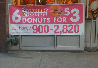
This might be the most honest advertisement I've ever seen! Although it is also a bit astounding: are those calorie counts
per donut? And really, is that supposed to be an inducement to buy, or a warning to run three laps around the block first?!
Dunkin' Donuts, I think you might have missed the mark with this one. But for those looking for to channel their creative energies into the magical field of donut-making, definitely check-out their latest promotion: the
Create Dunkin's Next Donut contest. Hey, you could win $12 grand!
Labels: advertising, Health, shopping


 Use OpenOffice.Org